


Putting my hands into the fire.
Since founding Hand + Fire in 2014, Sage has used three, easily impressed characters—h+f—to define the brand. To capture the minimalist essence of the brand, I sought to embody the essence of the Wallowa Valley using negative space to represent vast openness, clean patterns and textures, and natural colors that mimic the valley's natural heritage.
Honoring her typography and consistent use of lowercase, I aimed to reflect the studio’s journey from St. Helens to Wallowa. The frame represents her long-standing presence on Instagram, which played a key role in accelerating her business. The shoulder of the “h” connects seamlessly to the crossbar of the “f,” forming both the shape of the valley and a subtle “+,” symbolizing the union of craft and place.

<
<

>
>
Hand + Fire is a handmade pottery & homewares company with products sold across the world.
Project Type
Programs
Keywords
Branding
Web Design
Photoshop
Illustrator
Indesign
Square Space
Artistic
Nature
Simple
Negative space


Nature meets craftsmanship.
Branding an artist's pottery studio.
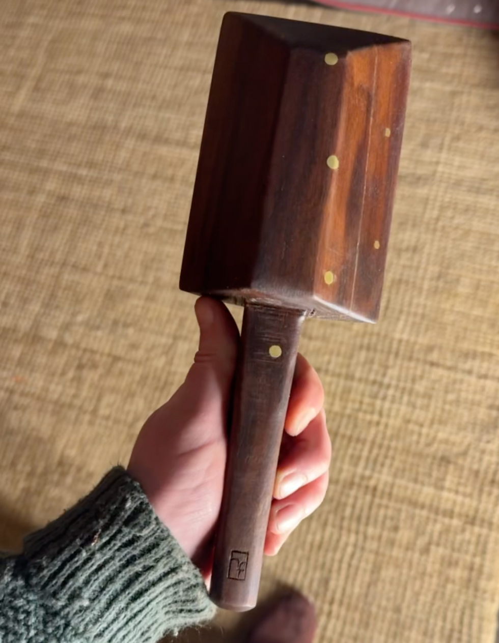
Hand + Fire is an artisan pottery and homewares brand known for its western and rustic aesthetic. Founded by artist Sage Cortez, whose work has been featured in Carnegie Hall and galleries across the Pacific Northwest, the brand embodies a deep connection to place and craftsmanship. Guided by her vision to bring fine art into everyday life, Sage draws inspiration from the natural beauty of the Wallowa Mountains, shaping each piece with a sense of artistry and belonging.
Translating this vision into digital form, I designed an online shop that would capture the elements of mindfulness, simple luxury, and wilderness that resonate with buyers. Each photograph emphasizes richness, depth, and detail to showcase products and reinforce brand identity while unembellished text allows for seamless navigation.

